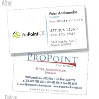
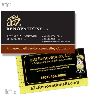
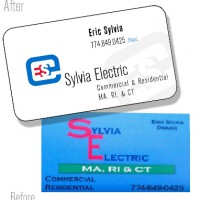
 Have you attended any networking events lately? The stack of business cards on your desk or dresser attest to the fact that people still exchange business cards, despite new technology.
Those cards can be one of your biggest investments. Sometimes this is all a potential client has that represents you. Take the time to design and print a proper introduction to yourself and your company.
Professional Printing
Using a professional printer and quality materials, combined with a great design, give your company the professional impression you desire.
This is not a place to skimp! Purchasing pre-cut cards, printing in-house on your home printer and ripping them apart along the perforated line says that you don’t value your own business.
The main point of your card is proper brand messaging and to provide contact information. It is not the place to list every service you provide. The proper design allows for enough white space to let your image come through.
Consistent Branding
You have a brand for your business – a name or image that identifies you and your mission. Use the colors and design elements already in place for your business. A bright yellow card may call attention to your investment company, but it can also send the wrong message. Yellow is the color of caution, and may actually keep potential clients away.
Make Your Card Work
If you use a QR code, direct it toward a more dynamic aspect of your website, such as a video or frequently updated page. Make the most of the space on your 2×3” card.


